Welcome to the vibrant, flowing world of watercolor painting! Getting started is all about understanding a simple, logical process: gathering your tools, sketching out your idea, laying down your first light washes of color, and then slowly building up darker, richer layers. Following this path takes the guesswork out of the process, giving you a clear road from a blank page to a finished piece.
Your First Steps Into the World of Watercolor

Diving into watercolors for the first time might seem a little intimidating, but it’s far more approachable than you think. Forget those overwhelming supply lists and dense art theory books. I’m here to frame this as an exciting creative adventure, not a chore. This guide will give you a simple roadmap of the core steps, so you feel prepared and excited, not stressed.
My goal is to demystify the entire process. I want to show you just how achievable creating beautiful, luminous art really is. And frankly, modern materials have made it easier than ever before.
A Quick Look at Modern Watercolors
It's easy to take for granted the convenience we have today. The commercial production of watercolor paints actually only started in the late 18th century. It wasn't until 1780 that William Reeves invented the first hard cakes of watercolor paint. Then, in 1846, companies like Winsor & Newton introduced moist paints in tubes, which was a game-changer. This simple innovation made colors more consistent and far easier to work with, causing a huge surge in the medium's popularity.
This guide simplifies that journey even further. We'll break it all down into small, manageable actions, covering everything from your initial setup to proudly signing your finished piece.
The most important step is simply starting. Every artist, from a complete beginner to a seasoned professional, begins with a blank sheet of paper and an idea. Your very first brushstroke is a victory in itself.
Once you get the hang of the logical flow, you’ll build a solid foundation. This framework actually gives you more creative freedom because it helps you avoid the most common frustrations.
Here’s a quick peek at what we'll cover:
- Smart Supply Selection: How to choose tools that will actually help you, not hold you back.
- Solid Prep Work: Getting your paper and palette ready for a smooth, enjoyable painting session.
- Layering with Confidence: Building depth and richness from transparent washes to fine, defining details.
- Essential Techniques: Mastering fun skills like wet-on-wet to add that professional flair to your work.
If you’re eager to see these concepts in action, feel free to check out these https://drawinglist.com/blog/drawing-ideas/easy-watercolor-tutorials for some great inspiration. Let's get you excited to finally put some paint on paper.
Getting Your Watercolor Gear Ready
Before you even dip a brush in water, you need to gather your supplies. Walking into an art store can feel overwhelming with all the choices, but trust me, you don't need the priciest gear to create something beautiful. The real goal is to put together a smart, functional kit that helps you learn, rather than getting in your way.
The Foundation: Your Paper
Your first and most important choice is paper. This isn't the place to skimp. The texture of watercolor paper dramatically changes how your paint behaves and what the final piece looks like. You'll mainly see two types on the shelves: cold press and hot press.
- Cold Press Paper: This is what most watercolor artists use, and for good reason. It has a distinct texture, often called "tooth," that's brilliant at grabbing pigment. If you're dreaming of creating those classic, soft-edged watercolor washes, this is the paper for you.
- Hot Press Paper: This paper is completely smooth. Its silky surface is perfect for artists who love to work in fine detail, create sharp lines, or blend their watercolor with ink pens or colored pencils.
If you're just starting out, I always suggest going with cold press. Its surface is more forgiving, making it a bit easier to manage your water and paint as you're learning the ropes.
Your Colors: Pans vs. Tubes
Next, let's talk about the paint itself. You'll find watercolors sold in two main forms: as solid cakes in pan sets or as liquid paint in tubes.
Pan sets are my go-to for painting on the move. They're compact, tidy, and perfect for quick sketches or painting outdoors. The colors are already laid out for you, so you can just open the lid and start painting.
Tube paints, on the other hand, are packed with rich, concentrated pigment. You squeeze a tiny bit onto a palette and activate it with water. I find them better for mixing up big, vibrant puddles of color for large washes, and they can be more cost-effective over time if you paint a lot.
From my experience, the best way to start is with a good-quality beginner pan set with about 12-24 colors. It gives you a great range for mixing without being overwhelming. As you discover which colors you use most, you can always buy individual tubes of those shades to supplement your kit.
Building Your Brush Collection
You absolutely do not need a giant jar full of brushes to start. In fact, it's much better to begin with just a few versatile workhorses. A couple of well-chosen brushes can do everything from laying down a broad wash for a sky to painting the most delicate details on a flower petal.
To help you get started, here's a quick look at the most essential supplies you'll need.
Essential Watercolor Supplies Comparison
Tool | Beginner Recommendation | Pro-Tip for Selection |
|---|---|---|
Round Brush | A size 8 or 10 is the perfect workhorse for lines, fills, and details. | Look for one that comes to a fine point when wet. This allows for great versatility. |
Flat Brush | A 1-inch flat brush is ideal for creating large, even washes for skies or backgrounds. | Check for soft but springy bristles that snap back into shape. |
Detail Brush | A small size 2 or 4 round brush gives you control for fine lines and textures. | A shorter handle can sometimes offer more control for intricate work. |
Making these smart choices upfront is a huge part of setting yourself up for success. By picking a versatile paper, a practical set of paints, and a few key brushes from a trusted brand like Winsor & Newton, you're building a toolkit that will truly support your growth as an artist. This way, your supplies become your ally, not a source of frustration.
Preparing Your Paper and Your Palette

A great painting session starts long before your brush ever dips into the paint. Honestly, solid prep work is the secret weapon behind a smooth, creative flow. Taking just a few minutes to get your space and materials in order can completely change the experience, saving you a lot of headaches later on.
This is all about setting yourself up for success. We're going to walk through a few simple but game-changing moves: getting your paper ready to handle water, organizing your palette so mixing becomes second nature, and laying down a light sketch to guide your vision.
Preventing Frustrating Paper Buckling
There’s nothing more annoying for a watercolor artist, new or experienced, than paper that buckles. As soon as you lay down a wash, the paper expands and creates these dreaded hills and valleys, making it impossible to get a smooth, even layer of color. Thankfully, a simple technique called stretching can stop this from ever happening.
I highly recommend this for any paper under 300 lb (640 gsm). You can buy a watercolor block where the sheets are pre-glued, but learning to stretch your own paper is a fundamental skill that will serve you well for years.
Here’s the basic process for stretching your paper:
- Give the sheet a good soak in cool water for about 5-10 minutes.
- Carefully lay it flat on a waterproof board—something like Gatorfoam or a standard drawing board works great.
- Secure all four edges tightly to the board using gummed tape or even staples.
- Let it dry completely. As it dries, it will pull itself taut like the head of a drum.
This little bit of effort up front ensures your paper stays perfectly flat, no matter how much water you throw at it.
A well-stretched paper is like a perfectly prepped canvas for an oil painter—it removes a major technical hurdle, allowing you to focus entirely on your creative expression rather than fighting with your materials.
Arranging Your Palette for Success
How you lay out your paints might seem like a small detail, but a logical setup can make your mixing process so much faster and more intuitive. Please, don't just squeeze your colors out wherever they land! Think about your palette as a mini color wheel.
For instance, I always arrange my colors in a specific order: I start with my yellows, move into the oranges and reds, then circle around to the blues and greens, and finish with my earth tones like browns and grays. This way, when I need to mix a vibrant green, my yellow and blue are already sitting right next to each other. It just makes sense.
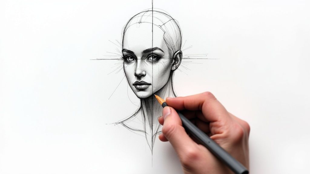
Sketching Your Composition Lightly
The last piece of prep is getting your idea onto the paper. The absolute key here is to sketch with an incredibly light hand. You want your pencil lines to be nothing more than a faint suggestion—a guide that will vanish completely under the transparent layers of paint.
You're not creating a detailed drawing; you're just mapping out the major shapes and getting the placement right. I suggest using a hard-lead pencil, like a 2H, and applying almost no pressure. This keeps you from creating little grooves in the paper where dark paint can settle and become a permanent, unwanted part of your work. Mastering this light touch is crucial for achieving that clean, fresh look we all love in a finished watercolor.
Alright, you've got your paper stretched and your palette is ready to go. Now for the best part—turning that blank sheet into something alive and full of light. The real magic of a luminous watercolor isn't in one perfect stroke. It's all about patience and building up your colors, layer by beautiful layer, always working from light to dark.
This layered approach is the heart and soul of watercolor. You'll start with incredibly light, transparent washes to set the mood and map out your brightest spots. Think of it as creating a blueprint of light for the whole painting. From that foundation, you’ll slowly introduce richer colors and deeper tones, letting the paint's natural transparency do the heavy lifting to create incredible depth.
Establishing Your Foundational Washes
Your very first layer should feel like it's more water than paint. This initial wash isn't about capturing details. It’s about blocking in the largest areas of light and general color. If you're painting a landscape, for instance, this is when you'd sweep in the soft, pale blue of the sky or the first whisper of green across a field.
The goal here is to keep these first washes exceptionally light and even. I've seen so many beginners start too dark, and in watercolor, that's a tough mistake to walk back. Always, always err on the side of being too light. You can add another layer to deepen a color, but you can rarely take one away.
The golden rule is to preserve the white of your paper. In traditional watercolor, the paper itself is your brightest white and your most brilliant highlight. By working light to dark, you're strategically protecting those areas, which is what gives a finished painting that stunning, lit-from-within glow.
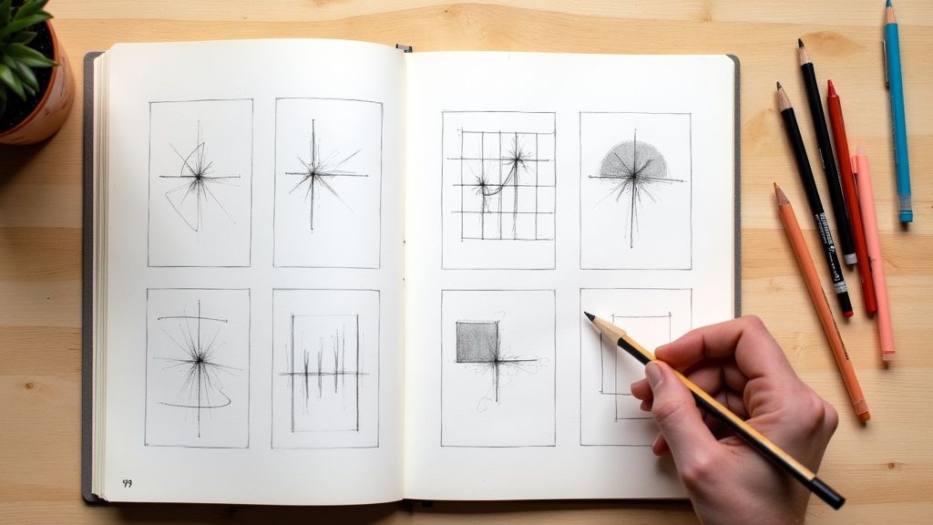
This visual shows exactly how the water-to-pigment ratio shifts as you move through the painting process.

As you can see, you start with very diluted washes and gradually move toward using more concentrated pigment for those final, sharp details.
Building Depth with Mid-Tones
Once that initial wash is completely bone-dry—and I mean completely—it's time to start defining shapes and building form with your mid-tones. These are the workhorse colors that exist between your lightest lights and your darkest darks. This is the stage where your painting really starts to feel three-dimensional.
Using a slightly thicker paint mixture (less water, more pigment), you'll begin layering new colors right over your first wash. This technique is called glazing, which is just applying a thin, transparent layer of color over another dry one. For example, you might glaze a warm, transparent yellow over a dry blue area to create a wonderfully complex green you couldn't get by just mixing on the palette.
This process has a long history, but the core steps have always been the same: a light sketch, the first wash, building color with glazes, adding darks and details, and—crucially—letting each layer dry. The development of materials like wove paper gave artists even more control. You can learn more about how these techniques evolved by reading up on the rise of watercolor painting on AmericanWatercolor.net.
Adding Dark Accents and Final Details
This is the final step, the one that makes your painting pop. You’ll use your darkest values and finest details to create contrast and guide the viewer's eye right where you want it. Remember, it's the darks that make your lights shine so brightly.
For these last touches, you'll want a thick, rich mix of paint. This is where you’ll define the crisp edge of a building, place the dark center of a flower, or paint the deep shadow that anchors an object to the ground.
Here are a few places to focus your final darks:
- Defining Shadows: A cast shadow under an object gives it weight and makes it feel real.
- Adding Texture: Use the tip of a small brush to add fine lines, dots, or cross-hatching to suggest the texture of tree bark or rough fabric.
- Creating a Focal Point: Placing your strongest contrast—your darkest dark right next to your lightest light—is a surefire way to create a focal point.
Be judicious with this final layer. It’s easy to get carried away, but too many dark details can quickly make a painting look busy or muddy. The idea is to use them strategically to enhance the beautiful mid-tones and highlights you've already worked so hard to establish. This patient, layered progression is what will give your work depth, confidence, and life.
Exploring Core Watercolor Techniques

Once you've got a handle on layering, it’s time for the fun part: adding real personality and flair to your paintings. Getting comfortable with a few core watercolor techniques is one of the most exciting steps you can take. These skills give you a versatile toolkit to create specific moods and textures, which is what elevates a good painting into a great one.
Let’s think of this as a hands-on workshop. We’re moving past the fundamentals and digging into the methods that will make your art truly sing.
The Magic of Wet-on-Wet
The wet-on-wet technique is probably what comes to mind when you picture classic watercolor. It’s the secret behind those soft, dreamy, and beautifully unpredictable effects. The idea is simple: you apply wet paint onto a section of the paper that you’ve already pre-wet with either clean water or another layer of wet paint.
Say you want to paint a dramatic, stormy sky. You’d start by brushing the entire sky area with clean water. Then, you can start dropping in your blues, grays, and maybe even some hints of pink. You get to watch them bloom and bleed into one another, creating incredibly natural-looking clouds without much effort. This method is my absolute go-to for atmospheric backgrounds and misty landscapes.
The real beauty of wet-on-wet lies in its unpredictability. You have to learn to let go of some control and just let the water and pigment do their thing. It’s a wonderful exercise in embracing the “happy accidents” that often lead to the most breathtaking results.
Achieving Crisp Edges with Wet-on-Dry
On the complete opposite end of the spectrum, the wet-on-dry technique is all about control and precision. This is where you apply wet paint onto completely dry paper. Using this method is how you get those sharp, defined edges, which are absolutely crucial for capturing detail.
For instance, painting a building would be a perfect time to use wet-on-dry for the crisp lines of the windows, doors, and roofline. It lets you paint one distinct shape right next to another without any bleeding, as long as you have the patience to let the first layer dry completely. This need for precision isn't unique to watercolor; artists diving into charcoal drawing for beginners also depend on careful application to define their forms.
Creating Highlights and Textures
So, what happens if you need to add a bright highlight to an area you’ve already painted over? This is where lifting becomes your best friend. With a clean, damp brush (a thirsty brush!) or even a corner of a paper towel, you can gently scrub a dry painted area to pull some of the pigment right off the paper. It’s a fantastic trick for creating the sparkle of light on water or soft highlights on a flower petal.
For adding some really interesting, organic texture, you can raid your kitchen cabinet for some salt. It's a classic trick for a reason!
- First, lay down a fairly dark, wet wash of color. This works wonders for things like rocky ground, tree bark, or a frosty windowpane.
- While the paint is still very wet and shiny, sprinkle a pinch of salt over it.
- Now, you have to be patient and let it dry completely. As it dries, the salt crystals absorb the pigment and push it away, leaving behind these incredible, star-like patterns.
- Once it’s bone dry, just brush the salt off the paper to reveal the unique texture underneath.
When you start combining these methods, you're really expanding your artistic vocabulary. It gives you the confidence to look at any subject and know you have the tools to bring it to life.
Polishing and Protecting Your Masterpiece
You’ve put the last brushstroke down, but your work isn't quite done. These final steps are what take a painting from a finished piece to a professional work of art, ready to be displayed and preserved for years to come. Think of it as shifting from the role of painter to the proud curator of your own creation.
The first, and honestly, the hardest part? Walk away. Seriously. Prop your painting up somewhere you'll see it, and just leave it alone for a day or so. You'll be amazed what you see when you come back with fresh eyes. That spot you were stressing over might look just right, or you'll suddenly spot a tiny detail that needs a final, delicate touch.
Signing Your Work
Once you’re completely happy with it, it’s time to add your signature. I know this can feel surprisingly stressful for a lot of artists. Where does it go? How big should it be?
Your signature should be a quiet confirmation of ownership, not a glaring distraction. It’s there to complement the composition, not compete with it.
My advice is to use a small, fine-tipped brush with a neutral color you've already used in the painting. Another great option is a waterproof archival ink pen. Find a spot in one of the lower corners where your signature feels balanced and doesn't pull the viewer's eye. Always practice on a scrap piece of paper first to nail down the size and feel before you commit to the real thing.
The Fixative Debate and Flattening Your Paper
To spray or not to spray? Using a UV archival varnish or fixative spray is a personal call with some real pros and cons. A good quality spray will definitely protect your painting from ambient moisture and fading from UV light. On the other hand, some painters feel it can slightly change the colors or dull the lovely matte finish of the paper. If you decide to go for it, make sure you're in a well-ventilated space and apply it in several thin, even coats.
If your paper has buckled (and let's be honest, it happens to all of us), there's a simple, effective fix.
- First, make sure the painting is 100% dry.
- Lightly spritz the back of the paper with a fine mist of clean water.
- Sandwich it between two clean sheets of absorbent paper, like parchment or plain newsprint.
- Finally, place it under a neat stack of heavy books for 24-48 hours.
The slight dampness lets the paper fibers relax, and the steady, even pressure flattens it perfectly as it dries. This little bit of extra care ensures your art is ready for a frame or safe storage.
Now that you've mastered the finishing touches, you're probably itching to start the next piece. For a never-ending source of inspiration, be sure to explore our list of daily drawing prompts.