Welcome to the wonderfully unpredictable world of watercolor painting. If you've ever felt a pull towards this luminous medium but were held back by its tricky reputation, you're in the right place. These watercolor tutorials step by step are designed to cut through the myths and get you painting with confidence.
Think of me as your guide, a fellow artist who’s been there. We'll walk through everything together, from choosing your very first supplies to creating a piece you’ll be genuinely proud of.
Your Journey into Watercolor Painting Starts Here

So many artists are captivated by watercolor's unique, flowing personality. But let's be honest—it's often seen as unforgiving. My main goal here is to completely dismantle that idea. With the right approach and a little bit of guidance, anyone can create something beautiful.
This isn't just another guide that lists supplies and sends you on your way. We're going to dig deeper. We’ll talk about why a certain paper works better for painting your first sky and how limiting your color palette can surprisingly make you a stronger painter. It's about more than just applying paint; it’s about learning to see and think like a watercolorist.
Why Start with Watercolor Now?
It's not just you—this classic medium is seeing a huge resurgence. This isn't just a fleeting trend; it’s a real movement driven by artists at every skill level who are drawn to its expressive power.
- A Growing Community: More people are picking up watercolor brushes than ever before. This means there's a fantastic, vibrant community out there to share techniques and inspiration with.
- Better, Cheaper Supplies: Getting started is easier than ever. High-quality beginner materials are now incredibly affordable and widely available, which really lowers the barrier to entry.
- Incredible Versatility: Watercolor can do it all. Whether you dream of painting loose, expressive florals or tight, detailed landscapes, this medium has you covered.
The numbers back this up, too. The global market for fine art watercolor paints, valued at $3.2 billion in 2025, is expected to soar to $6.1 billion by 2033. This isn't just a statistic; it shows that artists everywhere, from students to pros, are actively looking for step-by-step watercolor tutorials to hone their craft. You can explore more about this growing market and what's driving it.
Watercolor’s magic lies in its transparency and its beautiful unpredictability. The real secret is learning to work with the water, not against it. That’s the first and most important lesson.
Our journey together starts right there, by embracing what makes watercolor unique instead of fighting it. We'll break every technique down into simple, clear steps that feel less like a formal lesson and more like a creative adventure.
Getting Started: Choosing Your First Watercolor Tools

Walking into an art supply store can feel a bit intimidating. There's a whole wall of paints, papers, and brushes, and it's hard to know where to even begin. But here's the good news: you don't need a mountain of expensive gear to make beautiful watercolor paintings.
Let's cut through the noise and talk about what you really need to get started. The key is to invest in a few quality basics that won't fight you every step of the way.
Your Most Important Tool: The Paper
Believe it or not, the paper you choose will have a bigger impact on your early success than your paints or brushes. I see so many beginners get frustrated because they're using paper that just can't handle the water. Standard drawing paper will buckle and pill, turning your painting experience into a muddy mess.
You need paper that’s made for the job. For anyone just starting, my number one recommendation is cold press watercolor paper. It has a wonderful, subtle texture (often called "tooth") that gives you more control and makes blending colors feel much more natural. Hot press paper is completely smooth, which is great for fine detail but mercilessly shows every wobble and mistake.
The other crucial factor is weight. Look for paper that’s at least 140 lb (or 300 gsm). This thickness is your best defense against that dreaded warping and buckling.
My Pro Tip: The easiest way to keep your paper perfectly flat is to buy a watercolor block. It’s a pad of paper that's glued down on all four sides. You paint right on the top sheet, and it stays taut as it dries. Once you're done, you just slide a palette knife under the edge to release it. It's a game-changer for building confidence.
A Look at Your Essential Supplies
To make things even clearer, here’s a quick breakdown of the core supplies you'll want to have on hand. Don't worry about getting the absolute top-of-the-line versions of everything; a solid student-grade set will serve you incredibly well as you learn the ropes.
Essential Watercolor Supplies for Beginners
Supply Item | Recommended Type for Beginners | Why It's Important |
|---|---|---|
Paper | 140 lb (300 gsm) Cold Press | This weight prevents buckling, and the texture is forgiving for learning washes and blends. |
Paints | A Student-Grade Pan Set (12 colors) | Pans are portable and easy to activate. A limited palette forces you to master essential color mixing. |
Brushes | Round (size 8), Flat (1-inch), Detail (size 4) | This trio covers everything from broad washes to fine lines, giving you maximum versatility. |
Palette | Ceramic Plate or a Plastic Palette with Wells | You need a non-porous surface to mix your colors. A simple white ceramic plate works perfectly. |
Water Jars | Two Jars (e.g., old jam jars) | Use one jar for rinsing dirty brushes and the other for clean water to mix with your paints. |
Pencil & Eraser | Graphite Pencil (HB) & Kneaded Eraser | For sketching your initial design. A kneaded eraser won't damage the paper's surface. |
Having these core items will set you up for a fantastic painting experience without breaking the bank.
Choosing Your Colors: Pans vs. Tubes
Now, for the fun part—the paint! The main choice you'll face is between solid "pans" and liquid "tubes."
- Pans are little cakes of dry paint that you activate with a wet brush. They're incredibly convenient and portable, making them perfect for starting out or painting on the go.
- Tubes contain a thick, paste-like paint. They're great for mixing up larger puddles of color for big, juicy washes.
My advice? Start with a quality pan set that has about 12 colors. This might sound limiting, but it’s actually a blessing. It will teach you the invaluable skill of color mixing, which is the foundation of good painting.
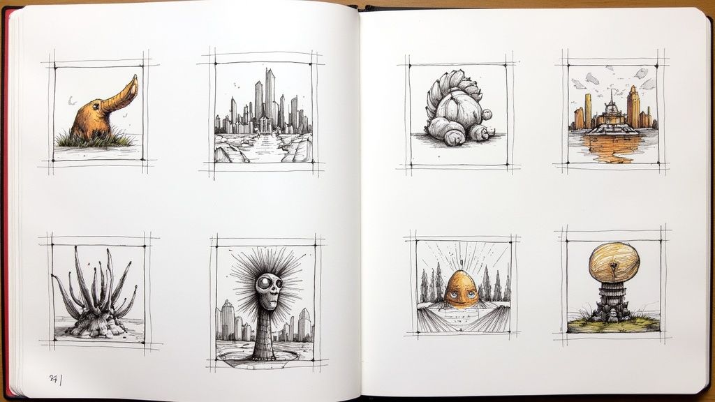
Once you have your painting gear, you can even explore how those skills translate to other mediums. If you want to strengthen your foundational art skills, check out our guide on beginner drawing ideas to see how sketching can improve your painting compositions.
The Only Three Brushes You Really Need
Don't fall for those giant, 20-piece brush sets. You'll end up using two or three of them, and the rest will just sit there. All you truly need to start are a few versatile shapes.
Here’s your essential toolkit:
- A Round Brush: If you buy only one, make it a size 8 or 10 round. It's the ultimate multi-tasker. You can use the fine point for details and the "belly" of the brush for broader strokes.
- A Flat Brush: A 1/2-inch or 1-inch flat brush is your best friend for laying down smooth, even washes of color for things like skies and backgrounds.
- A Detail Brush: Grab a small round, like a size 2 or 4, for adding those final touches—the little details that really make a painting sing.
Alright, you’ve got your gear, and you’re ready to go. Now for the fun part: actually putting paint on paper. This is where the real learning happens, moving past the theory and into the hands-on skills that will become second nature.
We're going to walk through the core techniques that are the bread and butter of watercolor painting. You’ll see these pop up in pretty much every watercolor tutorial step by step. Once you get a feel for these, you'll have the toolkit to paint anything you can dream up, from a hazy, soft-focus sky to the sharp, delicate edge of a flower petal.
Laying a Smooth Flat Wash
If there's one technique to master first, it's the flat wash. It's nothing more than a smooth, even layer of a single color. This is your go-to for skies, bodies of water, or any large area that needs consistent color. The real challenge is getting it perfectly uniform, with no streaks or splotches.
Here’s how I do it: I prop my paper up on a board or even a thick book to create a slight 15-20 degree angle. This lets gravity do some of the work. Then, I load up a big, thirsty brush with plenty of paint—don't be shy with the pigment and water here.
Starting at the top, I make one confident stroke across the page. A little "bead" of paint and water will pool at the bottom of that stroke. For the next stroke, I overlap the first one just enough to catch that bead and pull it downward. You just repeat this process all the way down. When you get to the bottom, dry your brush on a paper towel and gently touch the tip to the final bead to soak it up.
A classic beginner mistake is trying to "fix" a spot that's already starting to dry. Don't do it! You'll almost always create a blotchy mess. The secret is to work confidently and trust the process.
Wet-on-Wet for Dreamy Blends
This is where you really see the magic of watercolor unfold. The wet-on-wet technique is exactly what it sounds like: you apply wet paint to a surface that's already wet, either with clean water or another wash of color. The results are those beautiful, soft, and sometimes unpredictable blends that watercolors are famous for.
- Prep the Paper: First, brush a clean, even layer of water across the area you want to paint. You're aiming for a nice sheen, not a puddle. If it's too wet, the paint will just go everywhere.
- Drop in the Color: Gently touch your loaded brush to the wet paper. Just watch as the color blooms and spreads out, creating these wonderfully soft, feathered edges. You can drop in a few different colors and just let them mingle right on the paper.
- Control the Spread: The amount of water on your brush and on the paper dictates everything. More water means the paint will flow more, giving you less control. Less water gives you softer edges but with a bit more definition.
This is my favorite way to paint cloudy skies, misty mornings, or loose, expressive florals. Once you get the hang of this, you can even apply the same idea to other art forms. In fact, many drawing ideas for beginners can be beautifully adapted into soft, wet-on-wet watercolor paintings.
Wet-on-Dry for Crisp Details
On the flip side of the dreamy wet-on-wet method is wet-on-dry, which is all about precision and control. You’re simply applying wet paint to completely dry paper. Because the paper isn't wet, the paint stays exactly where you place it, giving you sharp, well-defined lines and shapes.
This is the technique you'll rely on for adding details on top of your initial washes. For example, after that soft, wet-on-wet sky has completely dried, you’d use wet-on-dry to paint a sharp mountain range or the distinct silhouette of a tree in front of it. It's how you build layers and create a real sense of depth and focus in your work.
Mastering Lifting and Glazing
Two other techniques that are absolutely essential are lifting and glazing. They sound fancy, but they're pretty straightforward.
Lifting is basically your watercolor eraser. While a wash is still damp, you can take a clean, "thirsty" brush (meaning it’s just damp, not soaking wet) and pull color right off the paper. It's perfect for creating highlights or softening edges, like making fluffy clouds in a blue sky.
Glazing is the art of building up color with thin, transparent layers. The key is to let each layer dry completely before adding the next. Each new glaze of color interacts with the one beneath it, allowing you to create incredibly rich, luminous colors and deep, complex shadows. This is what gives paintings that signature watercolor glow.
Painting Your First Simple Landscape
Alright, let's pull everything together and create an actual piece of art. This is the moment where all the talk about washes, paper, and brushes finally clicks. We're going to paint a simple, beautiful landscape, taking it from a basic sketch all the way to the final, layered details.
This is one of my favorite exercises for new painters because it uses the core skills we've just practiced. You'll get to see how a flat wash creates a sky, how wet-on-wet makes soft, dreamy clouds, and how wet-on-dry defines the crisp details that bring a painting to life. My hope is that finishing this piece gives you a real sense of accomplishment and the confidence to try something even more ambitious next time.
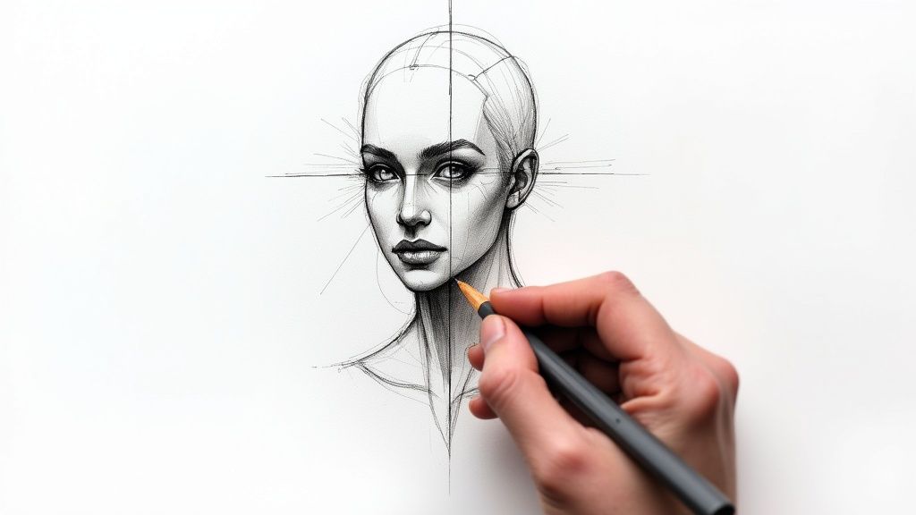
The Foundational Pencil Sketch
Before any paint touches the paper, we need a roadmap. That starts with a light pencil sketch. This isn't about creating a perfect drawing; it’s just about placing the main elements.
Grab your HB pencil and lightly draw a horizon line. I usually place mine about a third of the way up from the bottom of the paper. Don't stress about making it perfectly straight—a little wobble looks much more natural. Above the horizon, sketch in the soft, rolling shapes of distant hills. Keep the lines loose and simple. Maybe add a simple tree off to one side or the gentle curve of a path in the foreground.
A word of advice: keep your touch light. These pencil lines are just guides. If you press too hard, the graphite can lift and mix with your paint, creating muddy colors. Heavy lines can also be tough to hide under transparent watercolor washes.
Building the Sky with a Flat Wash
With our sketch in place, it’s time for that first, exciting layer of color: the sky. We'll be using that flat wash technique we covered earlier.
Go ahead and mix up a nice puddle of light blue. Something like a cerulean or ultramarine blue works perfectly. You want it mixed with plenty of water—think the consistency of skim milk. Now, prop your paper up at a slight angle. About 15 degrees is all you need; it just helps gravity do some of the work for you.
Load up your one-inch flat brush with the blue mixture. Starting at the top of your paper, make a smooth, confident stroke across the page, painting right down to where your hills begin. Immediately reload your brush and make another stroke just below the first, overlapping it enough to catch the bead of wet paint. Keep going like this until the whole sky area is filled.
This is the fundamental process we'll use over and over.

Honestly, this simple three-part rhythm—sketch, base layers, details—is the backbone of almost every watercolor painting I've ever made.
Creating Layers and Foreground Details
Now the real magic begins as we start building depth. First thing's first: make sure your sky layer is completely dry. I mean bone dry. If it's even a little damp, your next layer will bleed into it, and you'll lose the crisp edges we want for the hills.
Let's tackle those distant hills using a wet-on-dry approach.
- For the farthest hills, you'll want a muted, atmospheric color. A great way to mix this is to take your sky blue and add just a tiny touch of red or orange to it. This neutralizes the blue, pushing it back visually.
- Using your round brush, paint in that farthest hill. Now, step away and let it dry completely. Patience is key here.
- For the next hill, mix a color that's a bit darker and warmer. Maybe add a little more green or yellow to your mix. Paint this shape so it slightly overlaps the first hill. This technique, called glazing, is what creates that beautiful illusion of distance.
Once the hills are dry, it's time to bring the foreground forward. Mix up a rich green for the grassy areas. You can lay this down with a simple flat wash, or you can dab your brush to create a bit more texture. Here's a pro tip: while that green wash is still wet, try dropping in little touches of yellow or brown. The colors will mingle softly and create a much more natural, varied look.
Finally, the tree. This needs to be your sharpest, most defined element. Mix a dark, fairly thick paint. Using a detail brush, paint the trunk and branches with decisive strokes. Because you're working on dry paper, you'll get those crisp, clean lines that pull the tree right to the front of the scene, completing the sense of depth in your very first landscape.
Getting Creative with Advanced Effects and Mediums

Once you've got a good handle on the fundamental techniques, the real fun begins. This is when you can start adding that extra "wow" factor to your paintings, moving beyond simple washes to create textures and effects that give your art a signature look. You’d be surprised how many of these methods are incredibly simple but deliver gorgeous, professional results.
Think of these advanced techniques as your secret ingredients. A little dash here and there can completely transform a piece. We'll look at how to use some common household items and a few artist-grade mediums to add a whole new layer of personality to your work. Honestly, these are the details that take a painting from good to great.
Keep Your Whites White with Masking Fluid
If there's one tool every watercolor artist should have in their kit, it's masking fluid. It’s essentially a liquid latex that you paint onto your paper, forming a protective barrier over any area you want to keep perfectly white. After your painting is bone dry, you just gently rub the fluid off, revealing the crisp, untouched paper underneath.
It’s an absolute game-changer for things like the sunlit crest of a wave or the brilliant white foam of sea spray. I use it all the time for delicate details—the tiny white whiskers on a cat’s face or the bright stamens inside a flower. Just paint it on with an old brush, let it dry completely, paint right over it, and peel it away when you're done.
A quick pro-tip: Never use your good brushes with masking fluid, as it will destroy the bristles. Some artists will coat a brush in soap first to protect it, but I’ve found that a cheap, dedicated silicone tool works wonders and is much easier to clean.
Creating Amazing Textures with Salt and Splatters
Ready to feel like a magician? Sprinkling salt onto a wet wash is one of the most satisfying watercolor tricks out there. While your paint is still damp on the paper, just sprinkle on a bit of regular table salt or some coarse sea salt. As the area dries, the salt crystals soak up the water and pigment, creating these beautiful, starburst-like blooms. It's a fantastic effect for a sandy beach, a frosty window, or even a distant galaxy.
Splattering is another brilliant way to inject life and energy into your art. Load up a stiff-bristled brush with paint, hold it over your paper, and give it a sharp tap against your finger or another brush handle. You’ll get a fine spray of dots, perfect for sea mist, a field of wildflowers, or just adding a loose, abstract quality. For bigger, bolder drops, try loading up a brush and flicking it directly toward the paper.
Experimenting with Creative Watercolor Mediums
Diving into specialized mediums can truly open up a new dimension in your painting. These are additives you mix right into your paints to change how they behave on the paper.
- Granulation Medium: This stuff is amazing. It encourages the pigment particles in your paint to separate and clump together, creating a wonderful grainy texture. It’s perfect for adding character to things like old stone walls, weathered tree bark, or any rustic surface.
- Iridescent Medium: Want to add a little sparkle? A few drops of this mixed into your colors will give them a subtle, pearlescent shimmer that catches the light beautifully.
The demand for these kinds of special effects is growing fast. In fact, the market for watercolor mediums was estimated at $500 million in 2025 and is expected to continue climbing. This trend shows just how much artists are looking to push their creative limits, a theme you’ll see in many modern tutorials. You can read more about the rise of specialized watercolor mediums on Archive Market Research. As you get more comfortable, these effects are a fantastic way to elevate some simple easy drawing ideas and breathe new life into basic sketches.
Of course! Here is that section rewritten to sound like an experienced human artist, following all your guidelines.
Tackling Common Watercolor Questions
As you work your way through different tutorials, you're going to have questions. It's totally normal. In fact, every watercolor artist I know has run into these same roadblocks, so let's walk through some of the most common ones.
How Can I Fix a Watercolor Mistake?
The idea of fixing a mistake in watercolor can be intimidating, I get it. But it's often more possible than you think. For small slip-ups on dry paper, you can usually lift the paint. Just take a clean, damp brush, gently scrub the spot, and then blot it carefully with a paper towel. You might have to repeat this a few times.
If you’re dealing with a really stubborn pigment that's stained the paper, a tiny corner of a magic eraser can be a lifesaver. Be incredibly gentle, though, or you can tear up the paper's surface.
Honestly, the best advice I ever got was to learn to embrace the "happy accidents." An unexpected color bleed or a wobbly line can give your painting a unique charm you never could have planned for.
Why Is My Paper Wrinkling and Buckling?
Ah, the dreaded paper buckle. This happens when the paper gets wet, expands, and then dries unevenly. It's a classic sign that your paper isn't quite up to the task.
The simplest fix? Use heavier paper. There's a reason why 140 lb (300 gsm) paper is the go-to standard for most watercolorists—it can handle a lot more water without warping.
Another great option is to buy your paper in a "block." These are pads where the paper is glued down on all four sides, which forces it to stay flat while you paint and dry. You can also stretch your paper yourself by taping it down to a rigid board before you begin. It's an old-school method that works every time.
What's the Best Way to Mix My Colors?
My advice is to start small. Don't overwhelm yourself with dozens of tubes. A simple palette with a warm and a cool version of each primary color (red, yellow, and blue) is perfect. This really forces you to understand how colors play together.
When you're ready to mix, pull a little pigment of each color to the side of your palette. Then, using a clean, damp brush, slowly introduce the darker color into the lighter one. Doing it this way gives you so much more control over the value and hue.
One of the most valuable things you can do for yourself is to create a color-mixing chart. Mix every color on your palette with every other color and paint a small swatch. It feels like homework at first, but you'll end up referring to that chart constantly.
Ready for your next art project? Let Drawing List spark your creativity with thousands of unique prompts. Find your next drawing idea at https://www.drawinglist.com.